Nosutaru-dot (M+) Font
 Font")
The Nosutaru-dot (M+) font family may be ideal for you if you enjoy working on an artistic design project. The lively, expressive look of this typeface, which was created by logotype.jp, makes it ideal for Retro Gaming & 8-bit Aesthetics, Nostalgic or Vintage-themed Designs, Command Line Interfaces (CLIs) or Code Display, Warning or Error Messages (Stylized), Small Digital Displays, and other light-hearted visual projects.
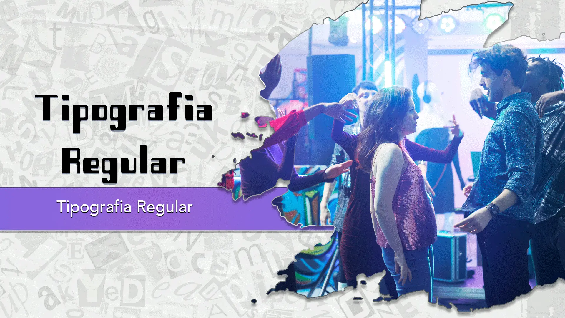
Regular are the one primary font styles of the Nosutaru-dot (M+) font family. You may build dynamic, visually appealing text layouts with the distinct flair that each style offers. With crisp, readable lines and a relaxed tone.
Things to consider when using Nosutaru-dot: 1. Readability 2. Context 3. Character Set
Now, there's something crucial to remember before you run off to employ it in your business. Since Nosutaru-dot (M+) font is a Public domain, GPL, OFL typeface.

Share:
Font you can consider!

185 Views

199 Views

148 Views

172 Views

208 Views

231 Views

173 Views

163 Views

164 Views

128 Views

152 Views

147 Views
Popular Fonts from Display